P08: Plotting with Matplotlib
Graphs and visualization
Data analysis starts with looking at data, and ends with communicating your results. Both of these are done most effectively with graphs.
There are many skills associated with making graphs and visualizations:
figuring out what to plot to answer a question.
transforming data to expose the variables you want to plot
choosing the right kind of plot for the data / question.
instructing a computer to make the plot you want.
making the plot interpretable, and appealing
Choosing plots
What are you looking for, or trying to show?
the distribution of one variable. -> histogram
the distribution of two variables: how two variables relate to one another -> scatter
how one variable changes as a function of a categorical other variable -> barplot
how one variable changes as a function of another numerical variable -> line plot
data
Gapminder: dataset describing life expentency depending on factors like life expectancy, GDP, Region, etc.
Standard plots:
histogram -> (density plot)
histscatter -> (bubble)
scatterline chart -> (+ error bars)
plotbar chart -> (+ error bars)
barlabeling axes.
xlabelandylabel
Our data
import pandas as pd
import matplotlib.pyplot as plt

font = {'family' : 'Arial',
        'weight' : 'normal',
        'size'   : '16'}

plt.rc('font', **font)  # pass in the font dict as kwargs
plt.rc('lines', linewidth = 2)
gm = pd.read_csv('gapminder.csv')
gm.head()
| Unnamed: 0 | country | continent | year | lifeExp | pop | gdpPercap | |
|---|---|---|---|---|---|---|---|
| 0 | 1 | Afghanistan | Asia | 1952 | 28.801 | 8425333 | 779.445314 |
| 1 | 2 | Afghanistan | Asia | 1957 | 30.332 | 9240934 | 820.853030 |
| 2 | 3 | Afghanistan | Asia | 1962 | 31.997 | 10267083 | 853.100710 |
| 3 | 4 | Afghanistan | Asia | 1967 | 34.020 | 11537966 | 836.197138 |
| 4 | 5 | Afghanistan | Asia | 1972 | 36.088 | 13079460 | 739.981106 |
# drop 'Unnamed: 0'
gm = pd.read_csv('gapminder.csv').drop(columns = 'Unnamed: 0')
gm.head()
| country | continent | year | lifeExp | pop | gdpPercap | |
|---|---|---|---|---|---|---|
| 0 | Afghanistan | Asia | 1952 | 28.801 | 8425333 | 779.445314 |
| 1 | Afghanistan | Asia | 1957 | 30.332 | 9240934 | 820.853030 |
| 2 | Afghanistan | Asia | 1962 | 31.997 | 10267083 | 853.100710 |
| 3 | Afghanistan | Asia | 1967 | 34.020 | 11537966 | 836.197138 |
| 4 | Afghanistan | Asia | 1972 | 36.088 | 13079460 | 739.981106 |
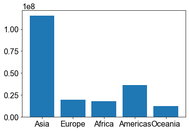
Plot population for each continent for a specific year (2007)
# grab the names of the continents
c_names = gm['continent'].unique()
print(c_names)
['Asia' 'Europe' 'Africa' 'Americas' 'Oceania']
continents = []
for c in c_names:
    m = gm[(gm['year'] == 2007) & (gm['continent'] == c)]['pop'].mean()
    continents.append(m)

continents
[115513752.33333333,
 19536617.633333333,
 17875763.307692308,
 35954847.36,
 12274973.5]
# plot! x-values (continent names), y-values (mean pop)
plt.bar(c_names, continents)
plt.show()
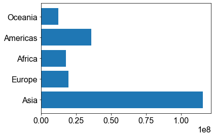
Horizontal bar plots…
plt.barh(c_names, continents)
plt.show()
Bar chart
How does life expectancy differ by continent?
{numerical variable} ~ {categorical} -> bar plot
category on the x axis, number on the y axis, and we get 1 number per category.
Mean life expectancy, in 2007, by continent
Introduce color, edgecolor, fontsize
age = []
for c in c_names:
    m = gm[(gm['year'] == 2007) & (gm['continent'] == c)]['lifeExp'].mean()
    age.append(m)

age
[70.72848484848484, 77.64859999999999, 54.80603846153845, 73.60812, 80.7195]
# make a bar plot
plt.bar(c_names, age,
           color = 'gold',
           edgecolor = 'navy')

# label stuff!
plt.xlabel('continent')
plt.ylabel('Mean Life Exp.')
# plt.xlabel('continent', fontsize = 24)
# plt.ylabel('Mean Life Exp.', fontsize = 24)
plt.xticks(rotation = 45)
plt.show()

# plt.rc - go over now...
#plt.bar?
Conventions
Learn the rules like a pro, so you can break them like an artist.
– Pablo Picasso
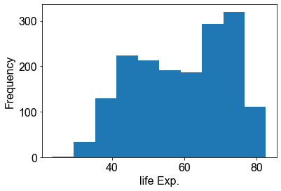
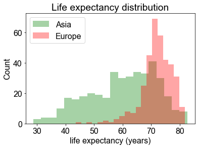
Histogram
Show the distribution of a single variable, which values are more or less common?
plt.hist(gm['lifeExp'])
plt.xlabel('life Exp.')
plt.ylabel('Frequency')
plt.show()
Make our hist look a little nicer…change number of bins, color, alpha (transparency), legend, etc.
plt.hist(gm[ gm['continent'] == 'Asia' ]['lifeExp'],
             bins=20,
             color='green', alpha = .35)

# what happens if you put plt.show() here???
# plt.show()

plt.hist(gm[ gm['continent'] == 'Europe' ]['lifeExp'],
             bins=20,
             color='red', alpha = .35)

# or can specify a range of bin edges
# plt.hist(gm['lifeExp'],
#              bins=range(20, 90, 5),
#              color='navy')

plt.xlabel('life expectancy (years)')
plt.ylabel('Count')
plt.title('Life expectancy distribution')
plt.legend(['Asia', 'Europe'])

plt.show()
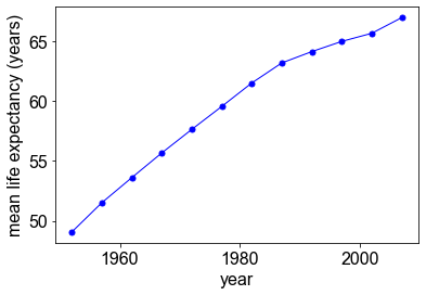
Line plot
How has average life expectancy changed from 1952 to 2007?
x = number, y = number, use line plot…
Mean life expectancy, by year.
## group by year
## calculate mean life expectancy per group

year_summary = (gm
    .groupby('year')                            # group based on common year labels
    .agg(life_expectancy = ('lifeExp', 'mean')) # aggregate lifeExp, compute mean, assign to new column 'life_expectancy'
    .reset_index())  # reset index to default...

# have a look...
year_summary
| year | life_expectancy | |
|---|---|---|
| 0 | 1952 | 49.057620 |
| 1 | 1957 | 51.507401 |
| 2 | 1962 | 53.609249 |
| 3 | 1967 | 55.678290 |
| 4 | 1972 | 57.647386 |
| 5 | 1977 | 59.570157 |
| 6 | 1982 | 61.533197 |
| 7 | 1987 | 63.212613 |
| 8 | 1992 | 64.160338 |
| 9 | 1997 | 65.014676 |
| 10 | 2002 | 65.694923 |
| 11 | 2007 | 67.007423 |
## make a line plot
plt.plot(year_summary['year'],
             year_summary['life_expectancy'],
            'bo-',            # blue, circle markers, solid line...
            markersize = 5,   # size of circle markers...
            linewidth = 1)

## label stuff!
plt.xlabel('year')
plt.ylabel('mean life expectancy (years)')

plt.show()
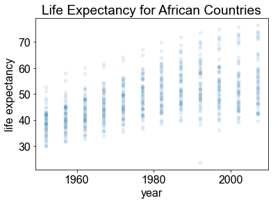
Scatter plot
How does the distribution of life expectancies across African countries vary by year?
distribution of two number -> scatterplot
import numpy as np

# filter out African countries
africa = gm[ gm['continent'] == 'Africa' ]

# plot scatter plot of lifeExp ~ year

# alpha so more dots visible
plt.scatter(africa['year'],
            africa['lifeExp'],
            alpha = 0.1,
            s=20)

# plt.scatter(africa['year'] + np.random.random(len(africa))*2-1,
#             africa['lifeExp'],
#             s=1)

plt.xlabel('year')
plt.ylabel('life expectancy')
plt.title('Life Expectancy for African Countries')

plt.show()
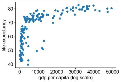
Varying color and size
year_2007 = gm[ gm['year']==2007 ]
plt.scatter(year_2007['gdpPercap'], year_2007['lifeExp'])
# plt.xscale('log')
plt.xlabel('gdp per capita (log scale)')
plt.ylabel('life expectancy')

plt.show()
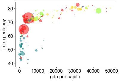
Same thing, but color code by continent and size by population
year_2007 = gm[ gm['year']==2007 ]

colors = {'Asia': 'red',
          'Europe' : 'gold',
           'Americas' : 'chartreuse',
           'Africa' : 'teal',
            'Oceania' : 'navy'}

plt.scatter(year_2007['gdpPercap'],
                year_2007['lifeExp'],
                s = year_2007['pop']/1e6,
                c = year_2007['continent'].map(colors),
                alpha = 0.5)

# plt.xscale('log')
plt.xlabel('gdp per capita')
plt.ylabel('life expectancy')
plt.show()

# color code by continent
# sale size by population
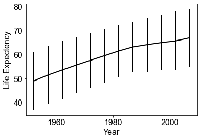
Errorbar example
Errorbar plots allow you to show the variability associated with measurements, not just their mean value
## group by year
## calculate mean life expectancy per group

year_mean = (gm
    .groupby('year')                            # group based on common year labels
    .agg(life_expectancy = ('lifeExp', 'mean')) # aggregate lifeExp, compute mean, assign to new column 'life_expectancy'
    .reset_index())  # reset index to default...

year_std = (gm
    .groupby('year')                            # group based on common year labels
    .agg(life_expectancy = ('lifeExp', 'std')) # aggregate lifeExp, compute mean, assign to new column 'life_expectancy'
    .reset_index())  # reset index to default...
# make the error bar plot showing mean +- standard deviation
plt.errorbar(year_mean['year'],
             year_mean['life_expectancy'],
             yerr=year_std['life_expectancy'], c='black')

plt.xlabel('Year')
plt.ylabel('Life Expectency')

plt.show()
Conventions
Distribution of Number -> histogram, with number on x, counts on y
Distribution of Category -> histogram, with category on x, counts on y
Number as a function of Category -> bar chart, category on x, mean number on y
Number as a function of Number -> scatter plot (y~x) or line plot (mean(y) ~ x)
Number as a function of Number + Category -> scatter plot or line plot with color varying by category.
Number as a function of Number + Number -> if it doesnt matter much: bubble chart. If it matters a lot, considering binning into categories.